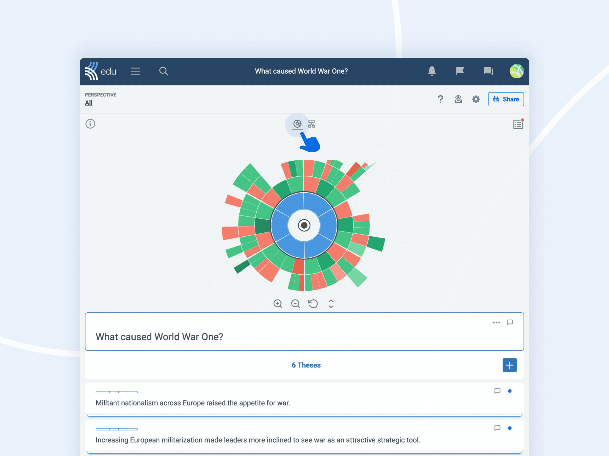
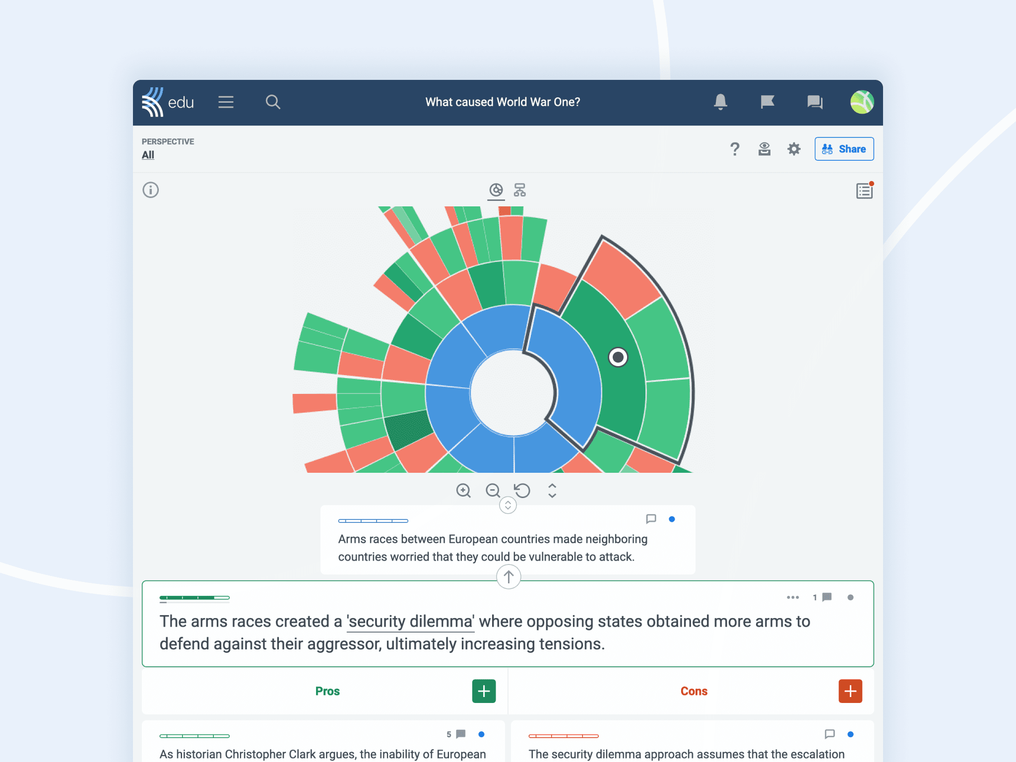
Over the years, lots of you have gotten in touch to tell us you love the sunburst. So we thought: why not stick it right at the top of the discussion?
From now on, you can toggle the minimap at the top of your discussion to show a new interactive sunburst instead of the argument tree. The sunburst can be used to browse the discussion, letting you keep the big picture while exploring in detail.

Let a little sunshine in
We still love the argument tree, but it doesn’t let you see all the claims in a discussion. With the new sunburst view, you can see everything.
A black dot highlights which claim you are focusing on, while a black frame highlights all the claims you can currently see on your screen. No more tunnel vision while exploring a deep branch in your favorite discussion!

We have even designed it so that the claims near the one you are reading are bigger, making it easier to access nearby claims quickly. You can also zoom in and out of the sunburst, expand it to fill more of the screen, and even drag it around to center important claims. Plus, the shade of the segments responds to the votes cast on those claims, letting you quickly scan for the strongest arguments.
The choice is yours
As great as we think the new sunburst view is, we know that people will always have their favorites. That’s why we’re leaving the argument tree as the default view and introducing a toggle button to change between the two. Feel free to experiment and see which option suits you best!

